


Making website forms fast and easy-to-use isn't just a dev's job. Gene Crawford says design significantly improves usability.
Maybe it's helping the user understand how data entered into a specific web form field will be used, or using field text for clarity: later in the process, it's our job as designers to think about how a user will look at, review and work with each web form field individually, and as a set.
Indicating help
Sometimes a form field doesn't make sense to the user, or maybe the user doesn’t understand the impact of what’s entered. This all works in tandem with creating a good experience, especially if the form is part of a complex chain of action or is inside of a web app. You could add helpful text below or near the form field, called microcopy.
Label alignment
Speed is an element we can control with web forms. Simply changing the way field labels are aligned can change the pace in which a person scans and uses the form itself. Designing form elements so that both the fields and labels line up horizontally reinforces the way people read and can make forms appear to take less time to complete.
If users need to work slowly to enter precise info, stacking the labels on top of the form field will take longer for the eye to scan and encourage users to work more slowly. While this is scientifically unproven, these ideas have been tested and written about elsewhere. Your own usability tests will likely prove it works.
Take a minute to think about how a person uses a web form, dissecting the parts of the form and how it’s used so that you can make the desired experience and outcome your goal.
Here are five examples to check out...
01. Squarespace
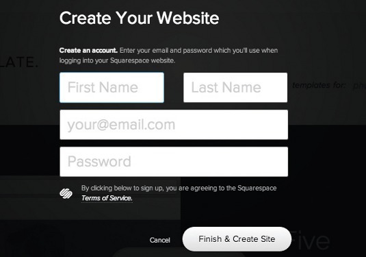
The web blog platform Squarespace places field titles inside the form elements. This saves space and makes the form look fast.
02. Desk
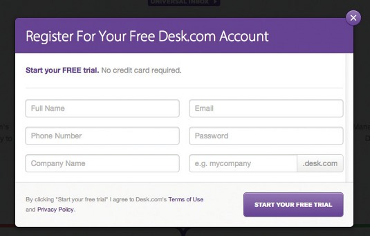
The team and customer support app Desk is a great example of a fast looking form. Pay attention to the way it’s shown the user how their username will work in tandem with the account’s login/domain.
03. Basecamp
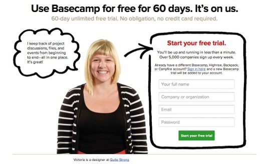
When you sign up for the project management app Basecamp, you’re greeted with a simply designed form that’s easy to understand.
04. Virb
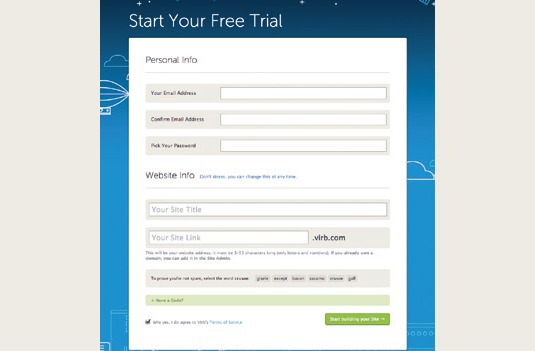
The signup form on the website creation platform Virb is an example of designing form elements to make the form look and feel fast as well as good use of microcopy.
05. Weightshift
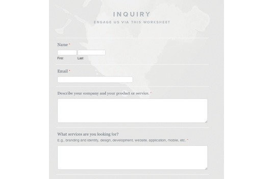
The project inquiry form on web design company Weightshift’s website is a great example of a contact type form that mixes top aligned and help copy under the first and last name fields so the user understands what’s expected of them.