


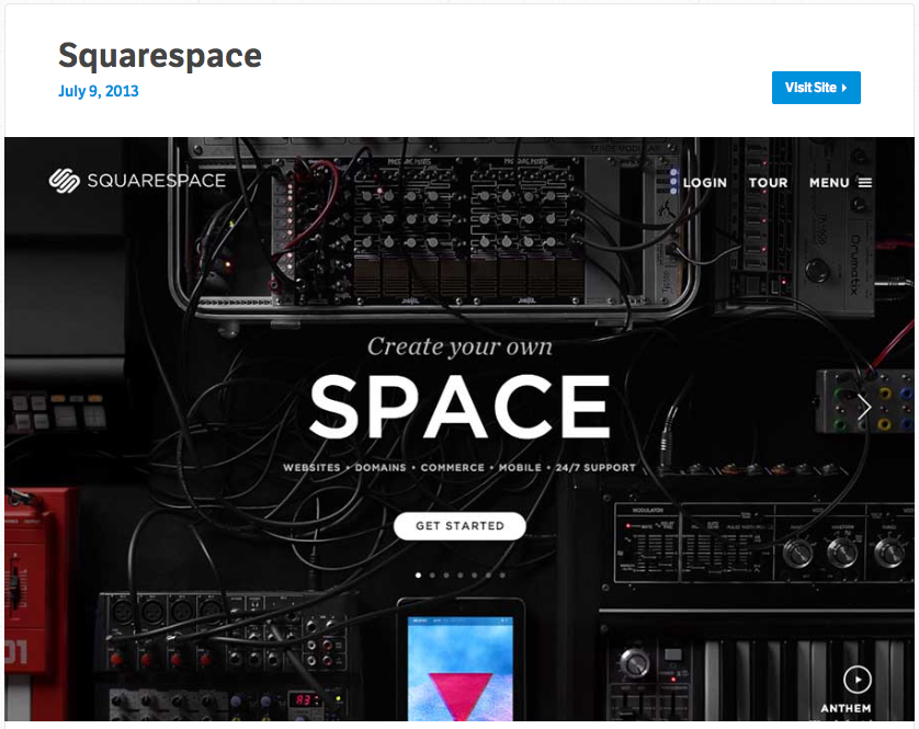
The updated Squarespace website design starts off with a homepage that’s pretty much just a giant slider. It’s a super clean, sleek and beautiful design across the board for sure.
One question I have about it though, and i’ve seen this on a lot of new sites is the “menu” on the right hand side of the page. You have to click on the word “menu” in order to see the navigation. To me this looks like a big “borrow” from iOS apps such as the Gmail and Facebook app. What and how do you guys all feel about this?