For developers and designers of successful (and profitable) web based applications, time and careful attention are given to the page where the users sign up or give their money. What point is there to creating a beautiful, functional application to only turn users off with a confusing signup page or convoluted pricing plans?
Generally, the companies that have a healthy financial leg to stand on have focused on making the experience of giving them your money as clear and as enjoyable as possible. In fact, with the good ones, you are happy to give them your money.
Good service from beginning to end is a pleasure to pay for.
Design Is More Than Looks
Here are 15 of the applications that show good design behind the entire process — whether it’s creating your account, comparing their pricing plans or entering in your credit card information. In this case, fast and easy are the goals.
And both are achievable.
Of course, capturing the essence of each page is hard to do when squished into a smaller screenshot. Feel free to click on each thumbnail to view the full page itself. Or view the entire collection here on my Ember account.
CampaignMonitor
One of the great email campaign services available today, CampaignMonitor has done a great job ensuring that an often confusing process is easy for their customers to understand. Clear language is used right from the start.
When you are introducing users to your service, clarity is a necessity.
Vimeo
Vimeo is one of the more popular video sharing services around — for good reason. It’s a well designed application. And the signup page is no different.
No confusing payment options here. It’s either free or less than $10 per month. Perhaps some would complain of a lack of options, but I like to err on the side of simplicity. Vimeo is just that.
Ballpark
If you’ve been reading this space from the beginning, you’ll know I have a strong appreciation for Ballpark. The strong visual design is not impeded by poor functionality in any way.
And that is clear from the start when you look at the pricing plans available.
Upload Robots
A nice looking alternative to a service like Dropbox, Upload Robots is another service that focuses on simplicity and a ‘just works’ mentality. This is clear on their dead simple registration page — there are only four required fields to fill out and no frustrating Captcha’s.
And the Upgrade
And the next step is nice as well, should you choose to upgrade to a Pro account. Nothing complicated here. Just an aesthetically pleasing page and one big, impossible-to-miss ‘Upgrade Today’ button.
Raveal
The team at Flowz took a different approach with Raveal. When you navigate to thesign up page, you are given two choices: Professional or Company. Both choices will give you multiple options for that account type. I think it’s a good way to break up the options rather than trying to squeeze it all in one page.
Best of all, each group of options pops on the screen with some nice javascript magic rather than reloading a whole new page. Nicely done.
Squarespace
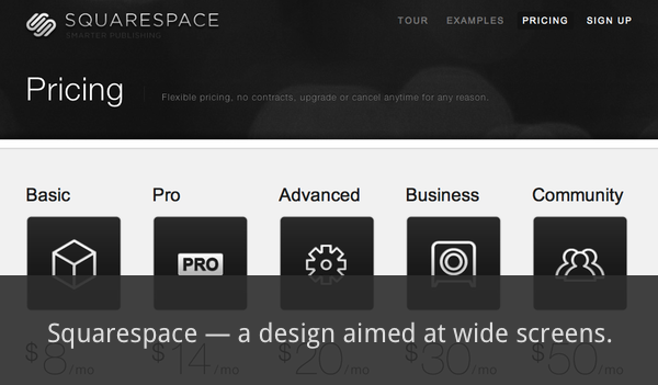
The do everything web service Squarespace has an interesting horizontal layout for their pricing and sign up pages. A good choice in this day of wide screen monitors.
SixCentral
Another clean example, SixCentral’s pricing page makes it easy for the end user to make a decision. You only have two options and each has a large, bright button to use.
Krop
The registration page at Krop is also well done. As you can see, there are also only two options here and the page is simply laid out.
Clicking on either option leads you to an equally simple page with minimal fields required.
Ember
Another app we’ve covered in this space, Ember has a good overall sign up page with only 3 fields required, an overview of the two account types and some FAQ type questions and answers on the side. It give’s the user everything they need with minimal action required.
YouVersion
A newer site that I’ve found, YouVersion is a sharp online Bible application. And itssign up page fits in with the others we’ve mentioned, with a clean design and minimal fields required to get started.
I love sites that enable you to sign up and get started, then allow you to fill in details later.
Tumblr
One of my favourite web applications, Tumblr is one of the easiest to start using. Three easy steps and you can start blogging.
Tumblr is the epitome of simplicity and user friendliness in my mind — and that is clear from the start.
Invoice Machine
The sign up page at The Invoice Machine is also nicely done. It has a few more fields to fill in, but I really appreciate the paragraphs in the side which lend clarity to exactly what you are signing on for. The text is large enough and well space — there’s nothing worse than being forced to read poorly written, cramped text online.
That is not the case here.
Less Accounting
With the guys who built LessAccounting, you quickly understand that for them, less is more. And that’s clear in the signup page for LessAccounting — there are minimal fields and a barebones page that takes up a fraction of the browser.
There’s nothing complicated here.
Action Method Online
Action Method is an approach to project management with resources that include a web app, iPhone app and paper tools. The web application, Action Method Online (AMO) has another good example of a clean sign up page.
There are a few more fields, but there is no clutter in the page at all.
Kontain
Similar to Squarespace, the unique sign up page at Kontain use a horizontal approach. And with only 4 fields required, the process couldn’t be easier.
In This Case, Size Matters
Again, be sure to visit each page for the full effect, or view my collection on Ember. Do you have some inspiring sign up or registration pages that you enjoy? Share with us in the comments.